The New Look for Gmail has been turned on for Berkeley Lab. This is similar to the look consumer users of Gmail have had for a number of weeks. It may take awhile for this to roll out to all users.
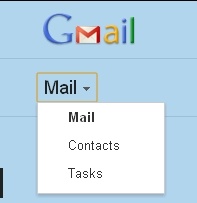
One change may confuse you: where we now see Mail, Contacts, and Tasks as separate links in the upper left hand corner, the new look has a single choice with a drop down allowing you to select something different.
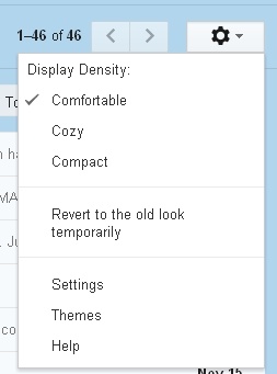
As was the case in Google Docs, you can select the density (comfortable, cozy, compact). Click the gear icon to see the choices including one that allows you to temporarily switch back to the old look.
For more information, check out the learning center which has video and written explanations - most are very intuitive.http://learn.googleapps.com/new-look-gmail

